DraftSight 2022’s New Features: Dark Mode
In his book “The Inevitable: Understanding the 12 Technological Forces That Will Shape Our Future,” Kevin Kelly insightfully pointed out Screening as one of the inevitable trends in the future. He argues that our lives will be surrounded by screens everywhere, such as computers, smartphones, and tablets as we already are experiencing every day. Even eyewear, car windows and building walls are being turned into screens to present driving directions, movies, or commercials. Mr. Kelly even refers to our current and future generations as “People of the Screen.”
While we can all feel this force every time we mindlessly check the phone, it tells only half of the story. Screens are to present information. What about the receiving end? Whatever is on screens, it must pass through our eyes, right? It feels pretty safe to say that the information flow bottleneck would be more at our eyes than screens. Just think about all kinds of glasses, dry eyes, and other vision challenges. I, for one, strangely find myself jealous of tearful eyes from time to time.
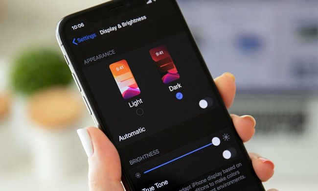
Hence comes the dark mode of popular software applications and devices, the purpose of which is to help reduce eye strain in low-light conditions and decrease energy consumption.

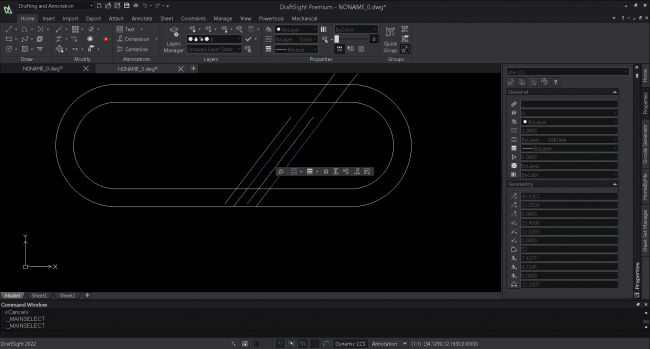
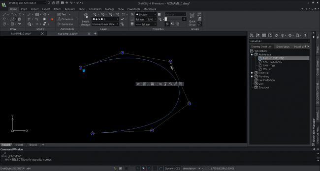
Similarly, as a popular software application used by millions of users worldwide, DraftSight receives frequent requests for Dark Mode too. Finally, I am happy to share that DraftSight 2022 has added the Dark Mode display as shown in Figure 3.
To alleviate vision fatigue and exhaustion, all the DraftSight interface elements, such as menus, ribbons, and palettes, have been purposefully redesigned to fit the dark display without compromising the visuals, providing a peaceful, low-stress, and pleasant experience if you prefer.
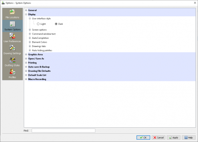
Turning on this display is easy too. The setting is located under System Options -> Display -> User interface style as shown in Figure 5. You just need to restart DraftSight to see the new interface.
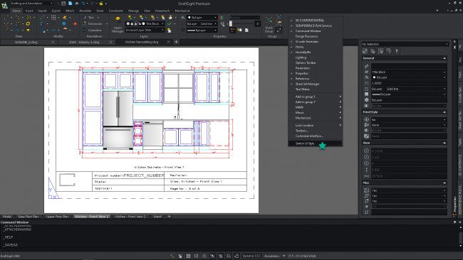
Even better, here is a quick access. You may also switch the style by right clicking on the command bar and selecting the command at the bottom.
Summary
There can be numerous screens in the world, but we have only one pair of eyes. Please take good care of them, and I hope that DraftSight 2022 Dark Mode can help. Also remember, Dark Mode saves energy too. In addition, this new release brings a long list of exciting new enhancements. Please visit https://www.draftsight.com/product/features to find more.
Instead of taking our word for it, we invite you to try it out for yourself. DraftSight 2022 is available as a free trial for 30 days. There are no strings attached – you won’t even be asked for credit card information.
Visit https://www.draftsight.com/freetrial to get started.


