Viewport Overrides in DraftSight
Most DraftSight users employ the modern workflow for drawing their designs at full scale in Model Space, then displaying them in a Sheet within a scaled Viewport. It’s there in the Sheet that they’ll apply their title block, dimensions, and other annotations.
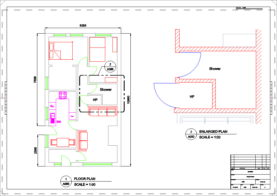
Among many other benefits of using this system, it allows the designer to have multiple views of the same design. Each Viewport on a sheet can even have different scales. Consider the image below, where we see our full floor plan in the left Viewport (Viewport frames are turned off) at 1:50 scale, and an enlarged plan on the right at 1:20 scale.
You may also notice that the enlarged plan looks different, and that’s the subject of today’s post. This is achieved by applying Viewport Overrides to the drawing’s layers, and they offer great flexibility in how each Viewport is displayed. Here are just a few reasons why a designer would apply these layer overrides to their views:
- Creating different views of the same drawing. By using different viewport overrides, designers can create multiple views of the same drawing without having to create separate drawings.
- Highlighting important details. By changing the color or linetype of certain objects, designers can draw attention to important details within a drawing.
- Simplifying complex drawings. By hiding or shading certain objects, designers can make complex drawings easier to read and understand.
In the image, the enlarged plan has wall hatching showing, the walls are now red, the doors are now blue, and the furniture is shown as a 50% transparent gray.

These are all different properties of the layers in the drawing. You’re probably familiar with changing these properties (and others) in Model Space. You know how that works, change the color of a layer, and all the entities on that layer (that are drawn By Layer) change their color.
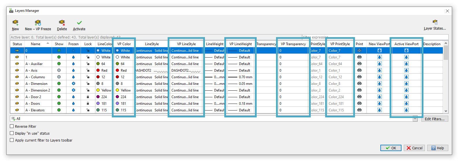
But when you call up DraftSight’s Layers Manager while in a Sheet, you’ll notice that it has grown. In fact, it will have six extra columns. Five of the six new columns have a header that begins with the letters VP, which stands for Viewport. One actually has the word Viewport in it.

Each of these are the overrides that you can apply to a specific Viewport. So, to achieve the results we see in the enlarged plan in our example, the first step is to activate that Viewport. While there are a couple of ways to do this, we prefer simply double-clicking within the boundaries of the Viewport.
Now, call up the Layers Manager dialog. Altering any of the properties labeled VP or Viewport will now only apply to the currently active Viewport. So, we did the following:
- Thawed the Wall Hatch layer
- Changed the Building layer from 8 to Red
- Changed the Windows and Doors layer from 80 to Blue
- Changed the Furniture layer from Red to a custom RGB value
- Changed the Furniture layer’s transparency from 0 to 50
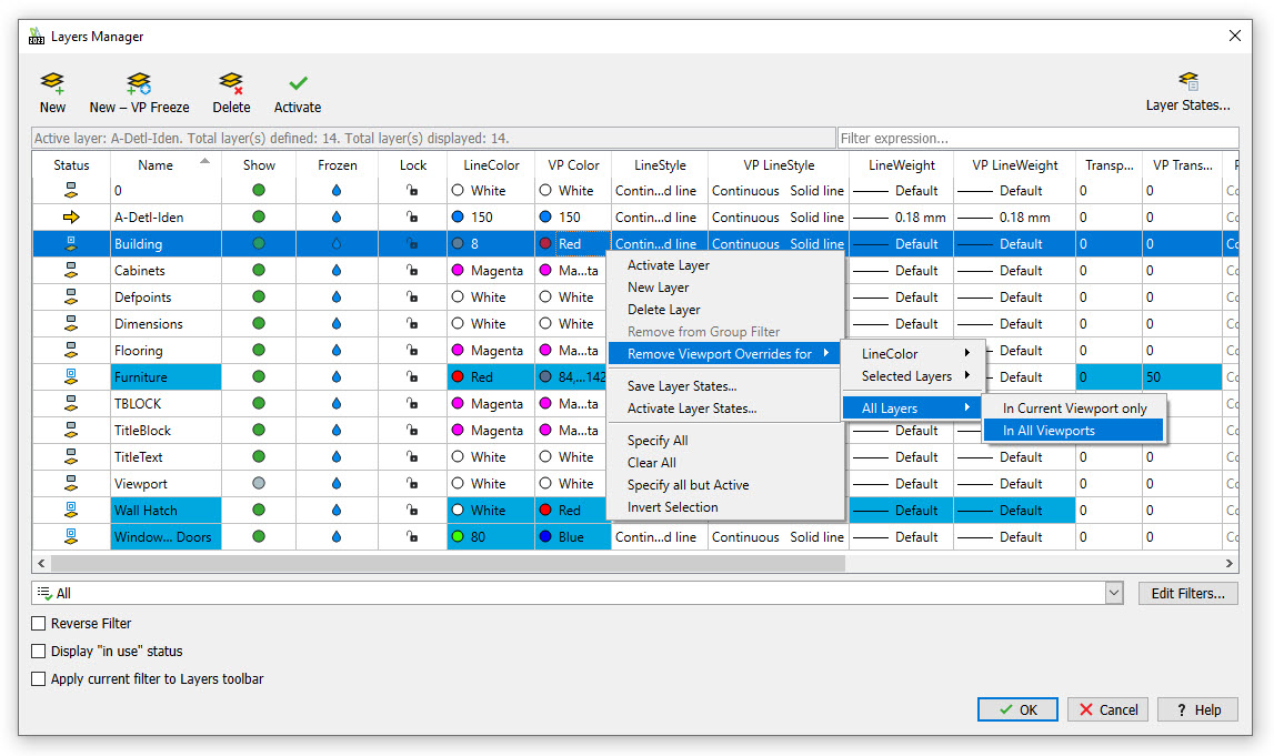
And here’s an added bonus. When you display the Layers Manager dialog while a Viewport with overrides is activated, the overrides will be displayed with a light blue background, so that you can easily identify what’s been overridden.
Removing the override or overrides (or returning them to their Model Space setting) is easy and offers a lot of flexibility. Just right-click on the override you want to remove, click on “Remove Viewport Overrides for…” and follow the flyout menu options. You can remove anywhere from all overrides in all viewports to just the one you right-clicked on. As we said, that’s a lot of flexibility.

Summing Up
Viewport overrides are a powerful feature in DraftSight that allow you to control the appearance of your design in each viewport. With viewport overrides, you can create different visual representations of your design in each viewport, allowing you to highlight different aspects of your design, or show different levels of detail.
If you’re interested in giving it a try for yourself, you can download a free, 30-day trial of DraftSight Premium. Just go here https://www.draftsight.com/freetrial and you can get started today.


