Customizing DraftSight: the Quick Access Toolbar
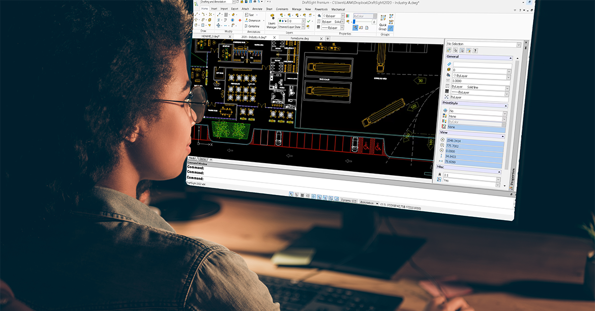
Perhaps you feel intimidated customizing your DraftSight interface. You may think it takes some special skills, or are afraid you might mess things up (although it’s easy to reset DraftSight back to default – it’s all explained in this blog post).
That’s why I think the Quick Access Toolbar (or the QAT from here on) is a perfect place to begin. Most people are aware of the tools that appear to the right of the Workspace pulldown, but I run into people all the time that don’t know what it’s called, or that it can easily be customized. It’s also easily accessible so you get big value with very little effort!
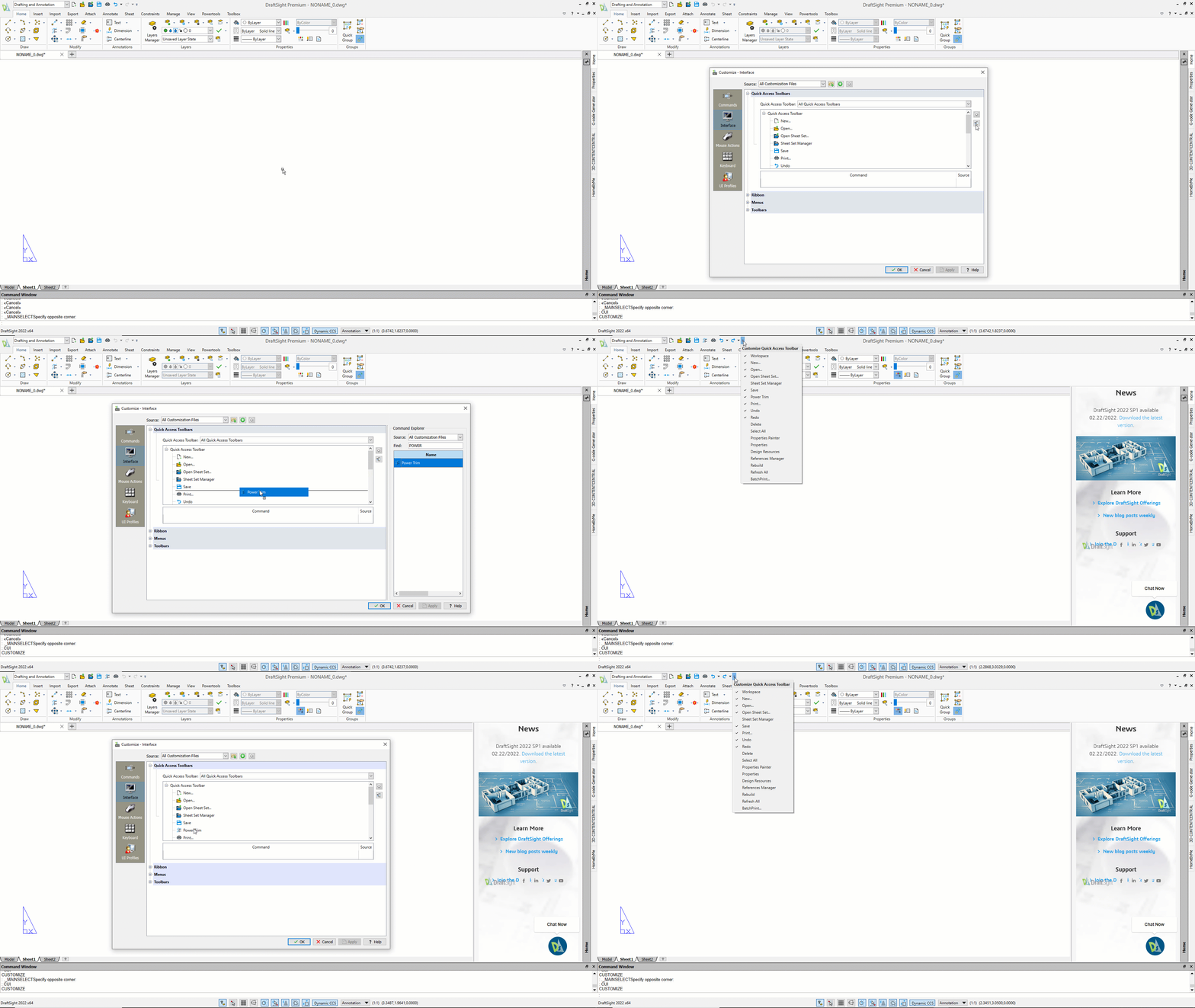
The first thing you need to do is squint your eyes really tight so you can see the itty-bitty pulldown icon on the right side of the QAT. Expand it to see all the default options that you can turn on or off. OK, that’s a good starting point. For instance, I like to have Sheet Set Manager and Properties Painter at my fingertips, so I turn them on.
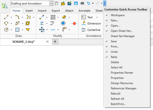
So that’s pretty cool and isn’t difficult at all. It’s just checking things to be on or off! But what if there’s a tool that you access all the time, but it’s not in the list DraftSight provides for you? Wouldn’t it be great if you could add it to the QAT? By now you may have already guessed the answer to that; you can! This is where the power of the QAT really comes into play.
First off, it’s not overly complicated, and if you find that you’re not using that tool as much as expected, it’s easy to remove later as well. Or perhaps it is just a temporary command. Let’s say your task for the day is designing display cases for a donut shop, and you need to use the Ring (DONUT) command all day. Pop it into the QAT, use it dozens of times, and remove it at the end of the day. Now that is productivity!
It all starts with the Customize (CUI) command. In the left-hand pane of the Customize dialog box, click on Interface, then expand the Quick Access Toolbars menu item. Finally, expand the Quick Access Toolbar entry in the list box and you’ll see all the pre-defined commands listed there.
Note: A quick word about this editing tool. It’s designed to allow you to create multiple QAT’s. While I’ve seen this done, it’s not very common, and if you’re a newbie at this, you probably just want to edit the existing QAT to add or remove a command.
OK, moving on. It’s time to squint again. See those two little icons on the right? One is a delete icon; don’t click on that. The other, just below it, will Show the Command Explorer. Click on that one. The dialog will expand and display an area for you to find your favorite tool.
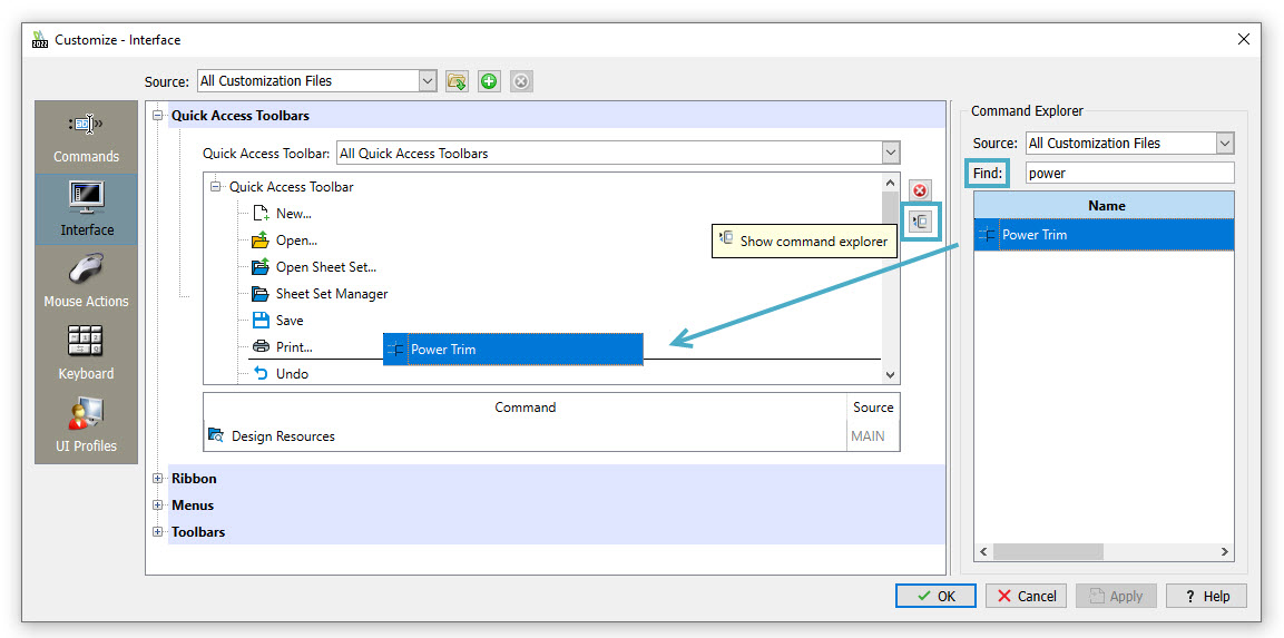
My favorite is PowerTrim, so as I start to type it into the Find box, it will eventually filter down to that command. When it appears, just drag and drop it wherever you want it to appear in your QAT command list. Click Apply and OK (or just OK), and presto! PowerTrim is now in your newly customized QAT.
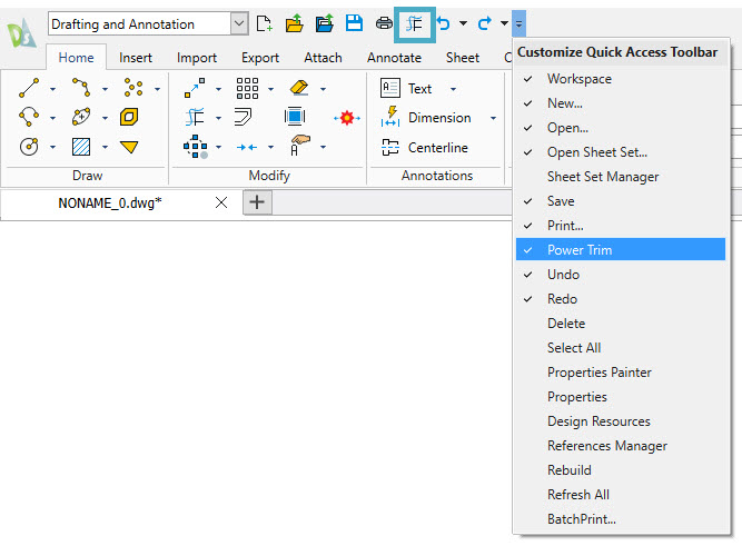
Well, that was pretty easy, and trust me, removing your command is just as easy, if not easier. Go back into the Customize dialog and navigate back to the QAT entry. Now, just hover over the tool you want to remove and right-click on it. You’ll get some menu items, one of which is Delete. Click it and the tool will be removed. Easy peasy. You can see the entire process in action in the animation shown below:
Now how hard was that? You’re right… it wasn’t. Hey, you know me, I’m all about the picks and clicks, right? If I can save some time by taking a moment to put a command into the QAT, you can bet I’ll do it You can do similar things with Mouse Gestures. Learn more about that here.
So don’t be intimidated when it comes to customizing the interface. It really can be quite easy, and if you’re not a DraftSight user (yet), you can give it a whirl and see for yourself. Download a fully functional, 30-day trial for free, and you can try out customizing the QAT, and all the other cool tools that DraftSight has to offer.


