Layer Properties Manager in DraftSight
Working with layers is one the most common tasks we do while working in any CAD program. Today, I want to help you learn more about DraftSight’s Layers Manager. The first difference you might notice is the name itself. It’s “Layers”, not “Layer” (don’t worry, we won’t charge you extra for the S). And that makes total sense to me, after all, who only works with one layer?
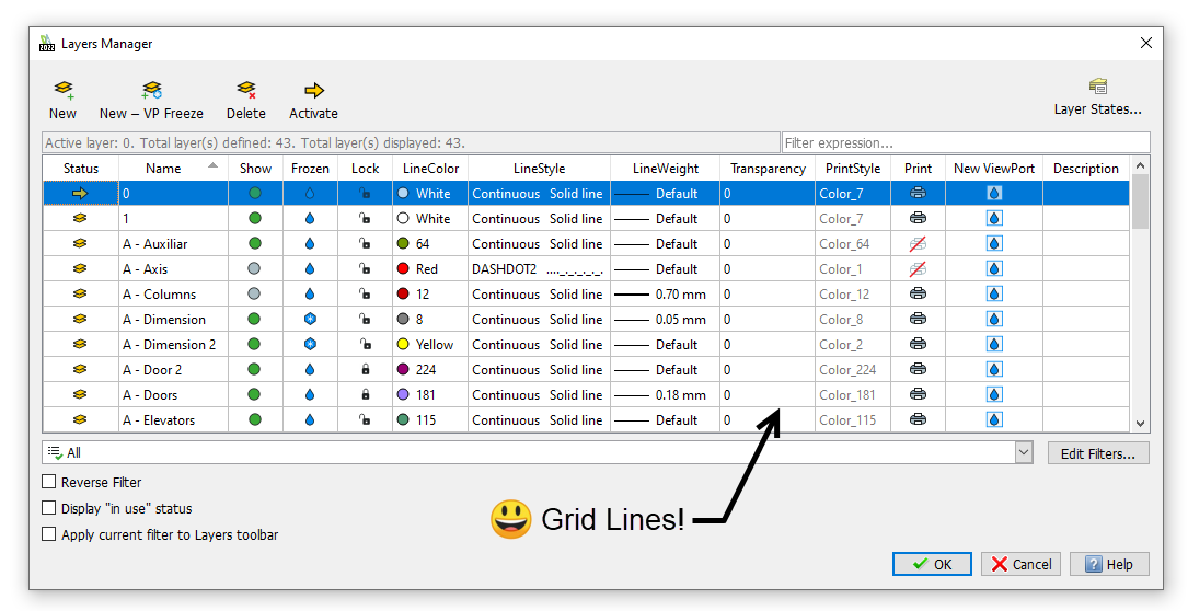
A couple of other things jump out at me right away. First off, look at those beautiful grid lines! This math major loves her organization, and grid lines always makes it easier to read your layer information.

The other thing I love is that the DraftSight Layers Manager uses words along with an icon for the tools shown above the layers grid. No more wasting valuable time hovering over those itty-bitty icons to find the one you need, just because you can’t tell one from another. And one of them is Activate, which is the same as what you might know as Current – which never made sense to me… they’re all my current layers, aren’t they? Simply put – you will select Activate to determine the layer you want to draw upon.
You’ll also find the Layer States Manager on the far-right side…again, complete with words so you can easily identify it. Don’t worry if you have existing saved layer states in your drawing either – DraftSight uses the same. LAS files that you may already be accustomed to using.
But, on with our tour. Shown above is the Model Space version of the Layers Manager. The functionality you expect is still there, but it behaves a bit differently in a few places. For example, DraftSight uses Show (and Don’t Show) instead of On and Off, which is actually more logical. Also, it uses a simple green or gray dot as an indicator.
Speaking of indicators, the Freeze/Thaw (along with New ViewPort) icon uses a water droplet to indicate that the layer is thawed, and a snowflake when frozen, which again, makes more sense than a yellow sun as the thawed condition. I mean, it can be sunny and cold at the same time, right? You can definitely tell which CAD company resides in California.
Another difference is the Status icon – which conveniently shows an arrow as the Active layer (love that!). Also, the Print icon is cleaner and easier to read by graying out the little printer icon and placing one of those international red slashes through it. It’s SO easy to spot quickly in DraftSight.
The Sheet Space Version
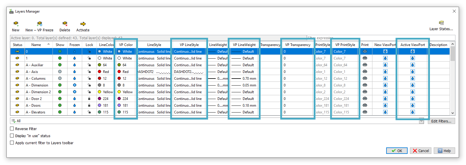
When you’re in a Sheet Space Layout tab, you’ll find that the Layers Manager has six extra columns. These are your current Viewport property controls. As you’d expect, DraftSight gives you the ability to independently control your entity’s Color, LineStyle, LineWeight, Transparency, and PrintStyle. For example, you can display your doors as Red in one Viewport, and Gray in another, all while maintaining their original ByLayer color of Green (as you would see them in Model Space).

Below the Layers grid in both versions, you’ll find all the layer filtering tools that you expect. Again, instead of tiny icons, you get words, buttons, checkboxes and pulldowns. This makes it so much easier to find and manipulate your property or group filters.
Wrapping it up
I think you’ll prefer the easy to view Layers Manager interface in DraftSight, while continuing to have access to all of the Layer tools and properties that you might already be used to.
But, as usual, don’t take my word for it. You can get a fully functional 30-day trial of DraftSight Premium absolutely free. Just go here: https://www.draftsight.com/freetrial to get your download today! I’ve even posted a blog to help you make the most of your 30 days. You can read all about it at this link.


